Checkbox component is deprecated
Custom checkbox can be implemented as a React native component which stores a boolean representative of whether it is checked, and is rendered as a TouchableHighlight component
Check React Native Installation for installation related info
Use react-native init command to create a new React Native project (here named NcCheckboxApp)
react-native init NcCheckboxAppThis creates a directory named NcCheckboxApp and initializes it as a react native application directory
This can be skipped in case an existing react native project is being integrated into
A check image is used for denoting checked state of a Checkbox checked functionality
download check image and put inside NcCheckboxApp (project directory)

The Checkbox component has following props
constructor() in default export App class declares
constructor() {
    super();
    selectedItems = [];
    this.state = { selectedItemsString: '' }
}Code for App.js file
import React, { Component } from 'react';
import { Alert, Image, Platform, StyleSheet, Text, TouchableHighlight, View } from 'react-native';
import PropTypes from 'prop-types';
// custom checkbox component class
class Checkbox extends Component {
constructor() {
super();
this.state = { checked: null }
}
// based on 'checked' state value, call pushItem() function of SelectedItems class using props
componentDidMount() {
if (this.props.checked) {
this.setState({ checked: true }, () => {
this.props.selectedItemsArray.push({
'key': this.props.key,
'label': this.props.label,
'value': this.props.value
});
});
}
else {
this.setState({ checked: false });
}
}
// to manage the checkbox checked and unchecked state and also insert values in array when checkbox is checked
toggleState(key, label, value) {
this.setState({ checked: !this.state.checked }, () => {
if (this.state.checked) {
this.props.selectedItemsArray.push({ 'key': key, 'label': label, 'value': value });
}
else {
this.props.selectedItemsArray.splice(this.props.selectedItemsArray.findIndex(x => x.key == key), 1);
}
});
}
// Creating Checkbox view using TouchableHighlight component
render() {
return (
<TouchableHighlight
onPress={this.toggleState.bind(this, this.props.key, this.props.label, this.props.value)}
underlayColor="transparent"
style={{ marginVertical: 10 }}>
<View style={{ flexDirection: 'row', alignItems: 'center' }}>
<View style={{ width: this.props.size, height: this.props.size, backgroundColor: this.props.color, padding: 3 }}>
{
(this.state.checked)
?
(<View style={styles.checkedView}>
<Image source={require('./assets/check.png')} style={styles.checkBoxImage} />
</View>)
:
(<View style={styles.uncheckedView} />)
}
</View>
<Text style={[styles.checkBoxLabelText, { color: this.props.labelColor }]}>{this.props.label}</Text>
</View>
</TouchableHighlight>
);
}
}
export default class App extends Component {
constructor() {
super();
selectedItems = [];
this.state = { selectedItemsString: '' }
}
// This function gets called on button on-press event to retrieve selected checkbox values and store in selectedItemsString state
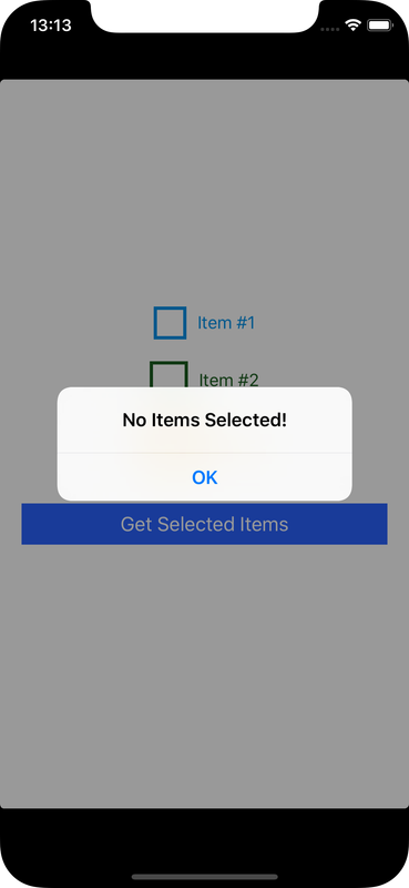
getSelectedItems = () => {
items = "";
if (selectedItems.length > 0) {
items = selectedItems.map(item => item.value).join();
}
else { Alert.alert('No Items Selected!'); }
this.setState(() => {
return {
selectedItemsString: items
}
});
}
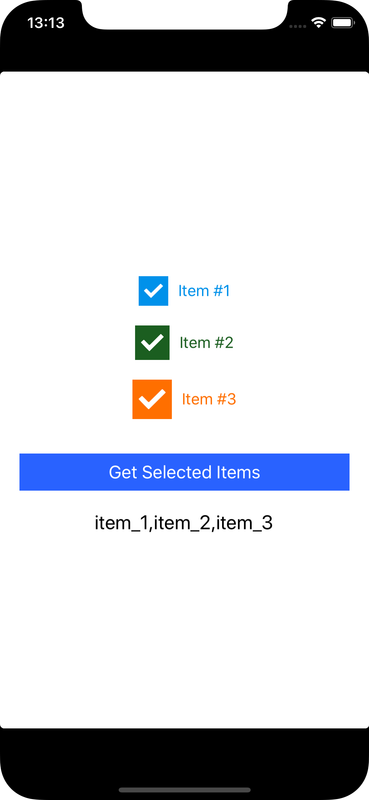
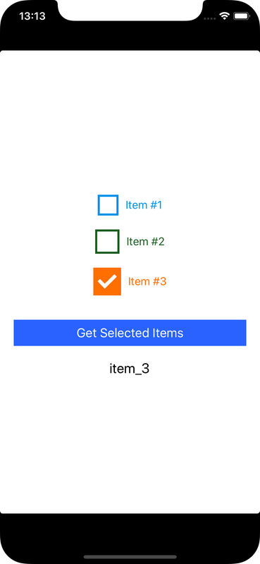
render() {
return (
<View style={styles.container}>
<Checkbox size={30}
key={1}
selectedItemsArray={selectedItems}
checked={true}
color="#0091EA"
labelColor="#0091EA"
label="Item #1"
value="item_1" />
<Checkbox size={35}
key={2}
selectedItemsArray={selectedItems}
checked={true}
color="#1B5E20"
labelColor="#1B5E20"
label="Item #2"
value="item_2" />
<Checkbox size={40}
key={3}
selectedItemsArray={selectedItems}
checked={true}
color="#FF6F00"
labelColor="#FF6F00"
label="Item #3"
value="item_3" />
<TouchableHighlight underlayColor="#000" style={styles.selectedItemsButton} onPress={this.getSelectedItems}>
<Text style={styles.selectedItemsButtonText}>Get Selected Items</Text>
</TouchableHighlight>
<Text style={{ fontSize: 20, color: "#000", marginTop: 20 }}> {this.state.selectedItemsString} </Text>
</View>
);
}
}
const styles = StyleSheet.create({
container: {
paddingTop: (Platform.OS === 'ios') ? 20 : 0,
flex: 1,
padding: 20,
justifyContent: 'center',
alignItems: 'center'
},
selectedItemsButton: {
marginTop: 25,
padding: 8,
backgroundColor: '#2962FF',
alignSelf: 'stretch'
},
selectedItemsButtonText: {
color: 'white',
textAlign: 'center',
alignSelf: 'stretch',
fontSize: 18
},
checkedView: {
flex: 1,
justifyContent: 'center',
alignItems: 'center'
},
checkBoxImage: {
height: '80%',
width: '80%',
tintColor: 'white',
resizeMode: 'contain'
},
uncheckedView: {
flex: 1,
backgroundColor: 'white'
},
checkBoxLabelText: {
fontSize: 16,
paddingLeft: 10
}
}
);
// Defining props default values and their data holder type
Checkbox.propTypes = {
size: PropTypes.number,
key: PropTypes.number.isRequired,
selectedItemsArray: PropTypes.array.isRequired,
color: PropTypes.string,
label: PropTypes.string,
labelColor: PropTypes.string,
value: PropTypes.string,
checked: PropTypes.bool
}
Checkbox.defaultProps = {
size: 30,
color: '#636c72',
labelColor: '636c72',
label: 'Default',
checked: false,
value: 'Default'
}cd into project directory (here NcCheckboxApp)
cd NcCheckboxAppRun metro server to serve js
react-native startGo to project directory in another terminal tab
Enter following run command for Android:
react-native run-android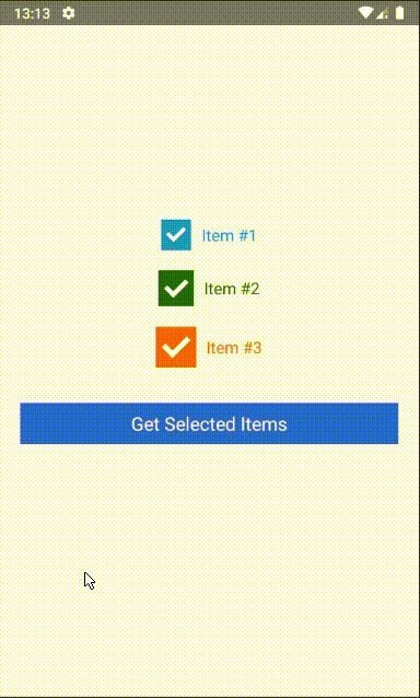
cd into project directory (here NcCheckboxApp)
cd NcCheckboxAppEnter following command :
react-native run-iosThis might take some time
If the app shows error about metro server not configured (check Running an App in iOS), then run metro server in another tab:
react-native startReload the app
Re-run react-native run-ios command if reloading doesn't work